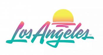
LA’s New Official Logo Has Angelenos Divided
LOS ANGELES (CBSLA) — The Los Angeles Tourism and Convention Board’s new official city logo left Angelenos divided Wednesday.
The logo features “Los Angeles” written in cursive, fading from pink to teal below a setting sun.
Others compared the new design to the “Miami Vice” logo and said it transported them to the 19080’s.
The board updated the logo as a welcome back to tourism after a “lost year” due to the COVID-19 pandemic. The logo was quietly unveiled June 16, just after California and Los Angeles County dropped most COVID-19 restrictions.
“The timing couldn’t be more perfect to unveil a fresh look for L.A. as we once again roll out the red carpet for visitors,” said Don Skeoch, chief marketing officer for Los Angeles Tourism.
“Los Angeles continues to evolve right before our eyes. As we emerge from this horrible pandemic, we continue to create those memorable experiences that visitors from around the globe cherish.”
The logo was designed by House Industries and Studio Number One, which was founded by artist Shepard Fairey.
“When you say ‘Los Angeles’ it doesn’t necessarily mean just a city,” Fairey said. “It’s a whole mindset, a vibe, a culture. And as an Angeleno, it was exciting to me to take on the creative challenge of designing a mark representing all the things that Los Angeles means to people.”


